Welcome back, design traveler! You’ve mastered the art of symbols, explored shapes, and learned about responsive logos. Now, it’s time to dig into the world where type does all the talking: wordmarks and lettermarks. If logos were a band, these guys would be the lead singers—loud, clear, and hard to ignore.
🅰️ What Are Wordmarks and Lettermarks?
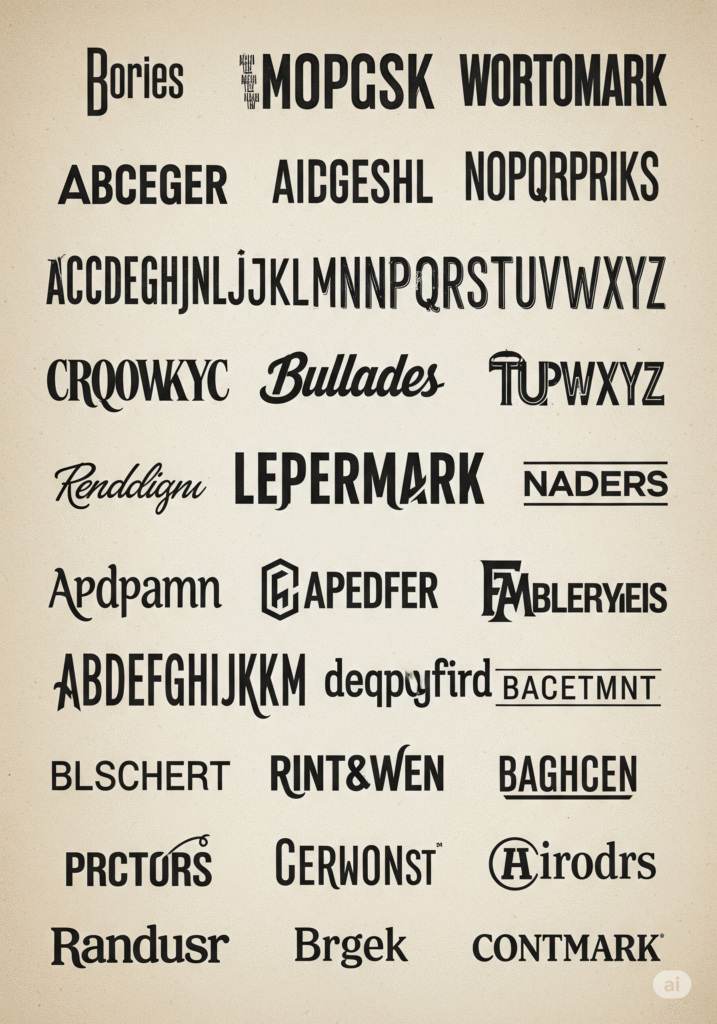
Both of these logo types rely entirely on typography—no icons, no illustrations, just pure letterform magic. But they do have different vibes and uses:
-
Wordmarks (aka logotypes): These are logos made up entirely of a company’s name in a styled font.
-
Think: Google, Coca-Cola, Disney, FedEx
-
-
Lettermarks (aka monogram logos): These are logos based on initials.
-
Think: IBM, CNN, NASA, HP
-
Both forms live and breathe typography, and when done right, they are iconic—even unforgettable.
✏️ When Should You Use Each?
Wordmarks are fantastic when:
-
Your brand name is distinctive and not too long
-
You want to increase name recognition
-
You don’t need a symbol to communicate your brand
Lettermarks are the go-to when:
Try out and download our best font for free 👀


-
Your company name is long, complicated, or hard to pronounce
-
You want a simple, scalable identity
-
You already have strong brand recognition
🎨 Typography: The Real Hero Here
The typeface you choose isn’t just about being pretty. It carries emotion, tone, and intent. Some considerations:
Serif vs Sans Serif
-
Serif: Traditional, authoritative, trustworthy (e.g., law firms, luxury brands)
-
Sans Serif: Modern, minimal, clean (e.g., tech startups, lifestyle brands)
Custom vs Stock Fonts
-
Custom typography (like Coca-Cola’s script) can make a logo iconic and ownable.
-
Modified stock fonts can still look unique if tweaked properly.
Spacing & Kerning
-
Letter spacing (kerning) can make or break a wordmark. Improper spacing makes it feel unpolished or amateurish.
Weight & Case
-
Uppercase tends to feel stronger and more formal.
-
Lowercase can feel more friendly and casual.
-
Mixing them? Bold move—but it can work (e.g., eBay or iTunes).
💡 Famous Case Studies
-
Google: Clean sans-serif wordmark with a playful color palette = instantly recognizable.
-
CNN: Bold, red lettermark—3 letters and it’s global.
-
Visa: Wordmark so simple, yet it evokes trust.
-
NASA: Lettermark that feels futuristic and strong—fitting for space explorers.
Each of these brands tells a story just through their type.
🛠️ How to Design Your Own
If you’re working on a wordmark or lettermark, here’s your mini-process:
Side Note : Promote & earn with Letterhanna’s affiliate program.

-
Start with the brand voice: Is the brand friendly? Premium? Playful? The typeface should echo that.
-
Explore typography options: Use font pairing tools or draw your own characters.
-
Experiment with custom tweaks: Ligatures, icon-style letters, or creative negative space (think FedEx’s arrow).
-
Test it in different contexts: Does it look good tiny? Printed? On a billboard?
Pro tip: Start with black and white. Color can distract you from seeing what really works.
📦 Bonus Thought: Pairing Wordmarks with Symbols
Some brands pair wordmarks with icons (like Spotify or Dropbox), allowing them to switch between full and compact logo modes. This hybrid model gives you the flexibility to grow your logo’s ecosystem.
But if you’re going for a pure wordmark or lettermark, your type must carry the full brand load. No pressure. 😉
🎯 Final Takeaway
Typography isn’t just design—it’s branding language. With wordmarks and lettermarks, you have the power to create logos that are bold, sophisticated, or fun, using nothing but letters. When done right, these logos become timeless.
🤯 Unique Fact of the Day
The FedEx logo is one of the most famous examples of hidden symbolism in typography. Look closely between the E and the x—see the arrow? It represents speed, direction, and precision. And it’s all just clever use of negative space.
Here Are Some Fonts You Might Love! 👀